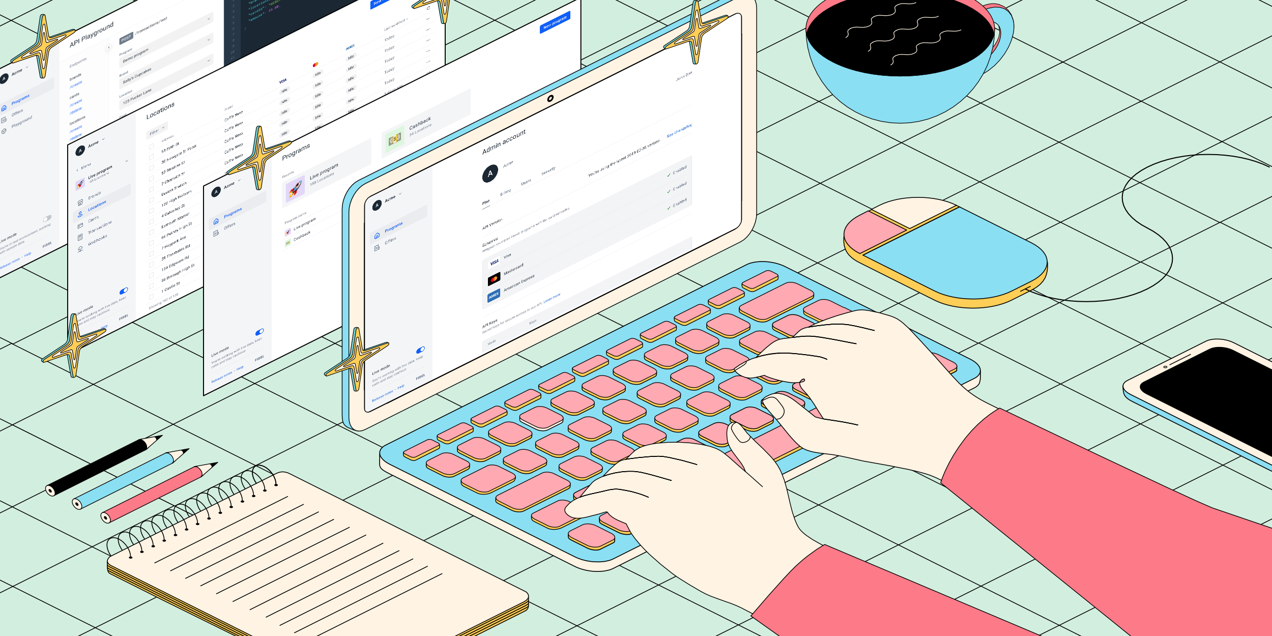
A Fresh Take on the Fidel Dashboard
In January of 2020, Fidel was a very different company.
We were a small team of 36 employees, working mostly in our offices in London and Lisbon. We’d just returned from a holiday gathering in our London office, where we talked about the future, celebrated 2019, and focused on what we wanted to accomplish in the coming year. While a lot of those plans changed with the coming of Covid-19, one project remained - we wanted to revamp our user dashboard.
For those of you new to the Fidel experience, you may not have much insight into working with our old dashboard. We certainly do. Our team works with the dashboard day in, day out, as much - if not more - than our users. It soon became clear our old dashboard was preventing a lot of our clients from scaling their programs successfully. It also wasn’t helping new users get to know Fidel and how we can help. So we made a plan to revamp the Dashboard from top to bottom.
They always say the first step to change is understanding where you need to improve, so we set off on a journey of discovery. With the help of our amazing customer team, we talked with our clients to understand their pain points. What made their jobs more difficult? What would help them move faster? Most importantly, how can Fidel help them innovate better?
Through this journey, we were able to better understand how our current customers are using our product. We also have users who use the dashboard to explore and discover what Fidel has to offer. For these users, we took a more quantitative approach to understand their user journey - looking at the activation funnel to help us understand where people were dropping off.
With this discovery under our belt, a few trends surfaced in the quantitative and qualitative data we were looking at:
- Merchant onboarding was slow and opaque. When we started this project, the time from giving Fidel merchant data to having real-time transactions flowing through for a location could be weeks. And worse, there was no communication on our end of how long this would take, which could leave our users hanging… for quite some time. In the cases where we couldn’t find a location’s merchant ID (aka the MID), users were forced to reach out to Support to get help. Basically, we weren’t following through on our own internal values of transparency.
- Users of our Offers platform couldn’t easily access offer data. Since we’ve launched our Offers API, we’ve made great strides in allowing our customers to use Fidel to qualify transactions based on specific parameters of an offer. However, in the old dashboard, it was difficult to see if a transaction had qualified for an offer and which offer it had qualified for. This made offer management quite difficult for our users.

- New users had trouble quickly unlocking the power of Fidel. With our old dashboard, we lost users who signed up for a test account in the middle of their onboarding. And that’s because we had no onboarding experience in the Dashboard. We had hoped they would find their way around, but we should’ve been better hosts. Users had trouble understanding how the Fidel API all fit together, and therefore, how to best utilize all the functionality Fidel had to offer.
When we first started this project, we thought we would make a few changes to features that would help improve on these pain points. However, as we went down that path, we realized that in order to have the impact we wanted, this was going to need a bigger overhaul. We also decided to migrate our dashboard from Angular to React, but we’ll save those details for another blog post. Given this, we gave ourselves permission to think a bit more freely about how might we solve our users’ problems.
This freedom sparked creativity, and we ended up including a ton of features, UX / UI improvements, and more in the new dashboard. To solve the problems we talked about earlier, we:
- Updated the merchant onboarding process to be faster. We looked at various ways that we could make the merchant onboarding process faster. We automated a few workflows that were previously done manually by our Customer team. During our conversations with our users, we also heard how frustrating it was to only be able to sync one batch of locations at a time. In the new dashboard, not only can users send locations to sync as frequently as they like, they also can automatically sync new locations. So far, this has brought our time to onboard a new merchant location down to a few days.
- Increased the transparency around merchant onboarding. Hearing that location sync felt a bit like a big black box, we wanted to help users feel more in control of their own destiny. We now have a countdown with an estimated number of days until the location will be synced. In the case when a location fails, we now allow users to submit a MID to help move the investigation along more quickly.

- Improved visibility of qualified transactions. We updated our transactions table to seamlessly integrate with offers. Now, when a user is running an offer on their program, they’ll be able to see qualified transactions, the offer they qualified for, and any other offer details in a single view.

- Made things more secure. Multiple employees at each of our clients tend to work on their Fidel account in the dashboard. To help improve the security of each account, we’ve introduced new user management features. There are now two levels of permissions within each account - Admin and Developer. Admins have full control over their team’s Fidel settings, from billing to security. Developers can work in the account, but do not have access to some of the more sensitive settings within the account. The best part is, each person can have their own login information!

- Did a bit of handholding. We wanted to do more for our new users, including giving them an onboarding tour. It shows them exactly how Fidel works, and hopefully sparks some creativity on how it could work for them! We now show users how to create a brand and location, add a card, and run a test transaction in our new playground to help them get to success more quickly. We’ve also added test data for new users, creating a demo program, brand and locations. It helps them get to the point where they can make their first real-time transaction faster.

- Made the whole thing a heck of a lot prettier and easier to navigate. This one goes unsaid in its importance. At Fidel, we strive to make developers’ lives easier, and this includes in their experience with our dashboard. We restructured our navigation, updated our UI, and added a bunch of new, user-focused features.

After doing all this work, we were really eager to release it to the masses. However, we realized how critical our dashboard is to many peoples’ workflows, so we decided to be a bit more careful and do a staged release. We first developed a dog-fooding feature that allowed our employees to use the dashboard for their day-to-day tasks. Feedback was critical for fast iteration, so we implemented a widget to help us quickly gather insights and see trends. Through this, we realized we had a few things to improve before sharing with clients (namely that no one could figure out how to get to their account settings - an important thing!). After weeks of testing with our employees, we were able to release to a group of beta users.
We want to extend a huge thank you to everyone who participated - these users gave us the feedback we needed to get the dashboard to where we are today: ready for launch to all of you.
Almost the entire company - now 55 strong - touched a piece of this dashboard as we brought it to life. We’re excited to keep building upon this experience and making it even better for our users. Our only ask of you is that you check out our feedback widget; it’s a major factor in helping us continuously improve. We’re proud to prioritize our users, and our mission is to help them be as successful as possible - this new dashboard brings us another critical step closer to that goal.